WorldServer is specialized language translation workflow management software. It allows large organizations to manage complex workflows for the purposes of translating industry specialized proprietary content in-house into many different languages. It is part of a closed-loop enterprise solution. See Language localisation. SDL Acquires Idiom. Oracle uses WorldServer.
• Redesign a flagship enterprise product that has not been updated in over 5 years
• Sync the new design theme with other SDL software products.
• Push design limits and remain ahead of industry competitors
• Make it more functional and faster for the user
• Data visualization (Design a new Dashboard)
• Competitive marketplace. Need access to competitors UI and customer sentiment
• Required to sync design theme with other SDL products while pushing design limits
• Many approval processes to overcome which made user testing difficult
• UX process not fully understood by some of the developers
• Lead UX Designer for Language technologies division
• Complex Use Case Definitions
• System Flow Diagrams
• Scalable Software as a Service Designs
• Data Visualization
• HTML interactive Prototype development
• User Testing
• Visual design
• Iconography
• Maintaining Jira, Confluence pages
• Training, Help & support material
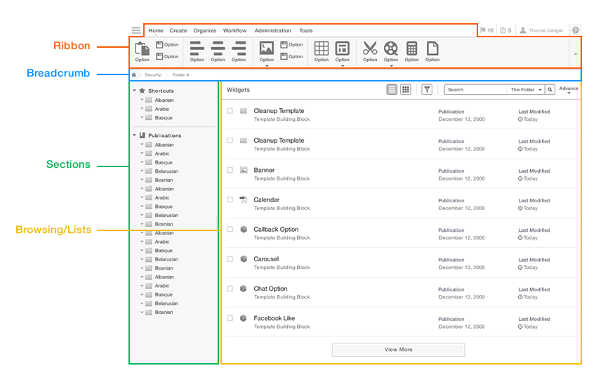
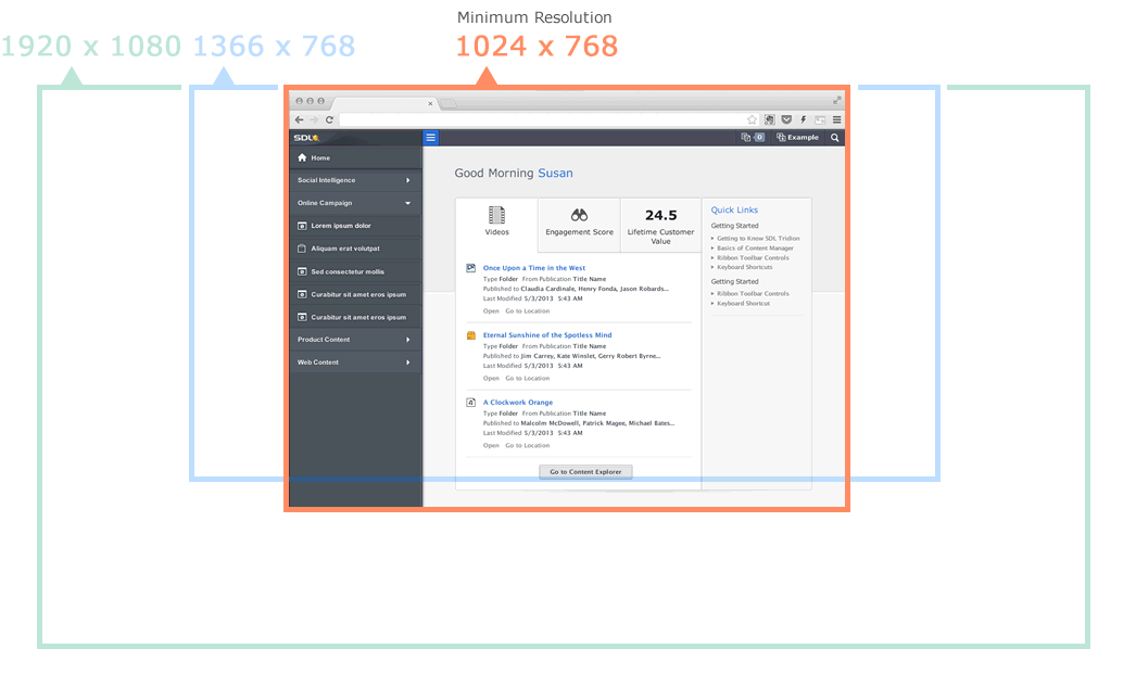
Requirements > Research > User Journies > Use Cases > IA > Low/High Wireframes > Prototypes > Visual Design > Feedback/Iteration/Approvals
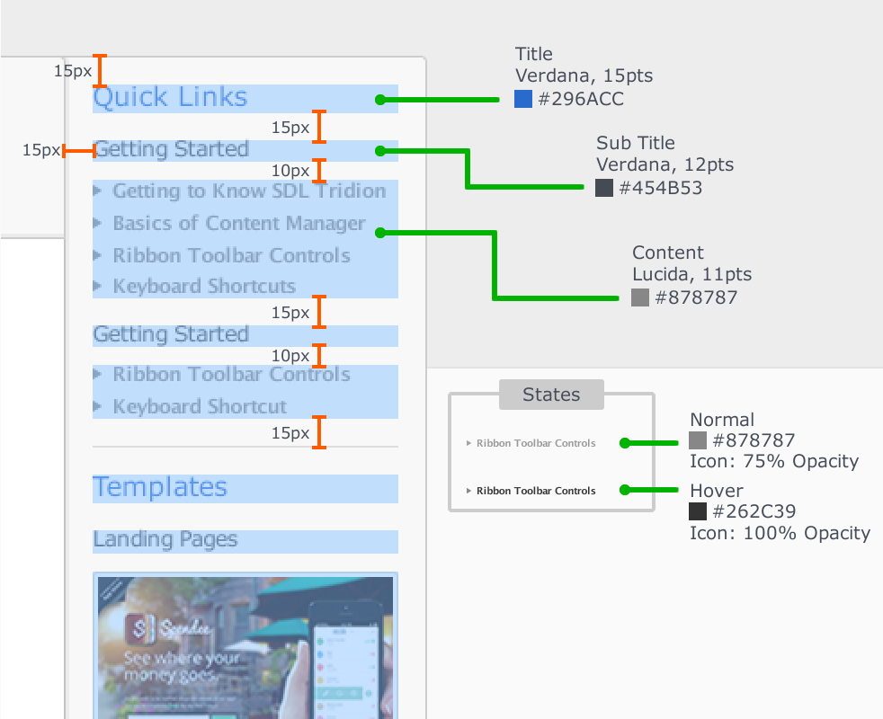
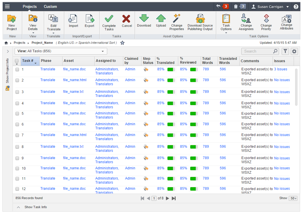
In addition to my main functions, the project also included working with many people and developing proprietary design pattern libraries, corporate style guides, personas, user feedback notes, data visualization, product material, training material, engineering progress and build information and other intellectual property typical in an enterprise environment.
The development environment was based on AGILE/SCRUM, with 2 week sprints being typical. UX stayed at least one sprint ahead of development. In some cases user testing needed to be factored into the work flow.
This is a sample of the feedback list I would create and maintain. The actual list had hundreds of feedback items from six different user types. User surveys were created with Survey Monkey and emailed to recipients. I conducted additional user interviews with hand selected users via Webex and would record the sessions and the users screen to capture work flow. The feedback list would be prioritized by the Product Manager and Development Manger. All documentation lists were maintained in JIRA and Confluence.
These are use case highlights from the many personas in the Language Translation & Machine Translation field to get a better understanding of workflow requirements.
Design patterns were developed and maintained for the redesign of the software
At specified resolutions the template would resize accordingly.
Stylesheet data would be maintained in the UX section on Confluence and JIRA
Task List - A - This screen shows the new architecture. The ribbon bar is a new feature and was designed from scratch. I had to research the logic of the ribbon bar which included research into Microsoft's evolution of the ribbon bar. The new bread crumb also introduced the ability to navigate. The new task grid allowed for Shift selection and +/- control click selection to more accurate emulate features you would expect from a spreadsheet program. Draggable columns were also introduced as well as a revised pagination schema that went thru much deliberation.
Task List B - This screen shows the new left panel that is can be customized with project information. Each field can displayed or hidden and custom fields can be added. This was requested by the project managers so they can view consolidated information in one place. Previously the data shown in the left panel had to be access via 3 different screens. Typically before the users would have different browser tabs set to different screens and the user would flip between browser tabs. The left project panel can also be collapsed and dragged into position where it can be then toggled back and forth.
Task List - C This screen show the new Task Info panel that lets users see relevant project data. In the old design the user had to drill down another level to another list screen the see information they needed and then had to navigate back to the previous screen to use existing functionality. This extraneous user path needed to be addressed. In addition to bringing data and information up one level, functionality was brought up to the new ribbon bar which addressed many uses cases regarding improved functionality.
Task List - D This screen shows all three panels together in a 1024 format. The UI is fully scalable and can handle large amounts of data. This screen is the result of many user research and testing sessions to establish work flow goals, needs and functional requirements. It represents the architecture of hundreds of use cases, stake holders requirements and my vission of what good SaaS design looks like for this type of enterprise environment.
Core Project Manager use case - Create a new project